
Lëtzebuerger Journal
Founded in 1948, the Lëtzebuerger Journal is the first of Luxembourg's major dailies to offer new perspectives on the subjects that they cover.
In order to face the cross-media trends that are shaking the foundations of quality journalism, the Lëtzebuerger Journal has decided to act. Thus, since January 1, 2021, the newspaper has become a 100% online platform.
A new custom-made brand identity
Explose created a new custom identity for the Lëtzebuerger Journal. The logotype needed to have impact, but above all it had to fit their minimalist branding.
We wanted to give typography a central place in the new brand identity of Lëtzebuerger Journal. The subtle use of colours also played an integral part of Journal.lu We opted for pastel colours to make it overall more dynamic.

Typography as a central element
Historically, the use of typography has played a very important role in journalism. In order to give a unique style to the identity of the Lëtzebuerger Journal, Explose went with a modern and minimalistic font, with a classical yet original touch.
Explose refined the typography down to the last detail, opting for a sans-serif font, to give a unique style desired by the Lëtzebuerger Journal.


A modern and immersive web platform
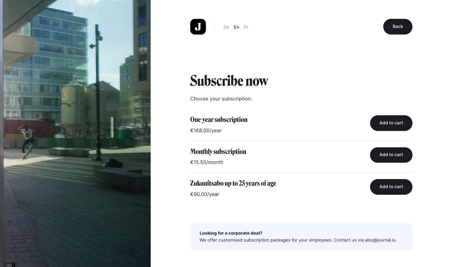
The Lëtzebuerger Journal is originally a paid paper newspaper, but it has gone 100% digital since January 1st, 2021. The challenge of this project was to translate its traditional business into a digital version. The Journal.lu platform allows users to create their own accounts, so they can manage their subscriptions, but also buy individual articles.


Another purpose of the redesign was to realize a multilingual website, offering journalistic content that encourages critical thinking and opens up a democratic debate amongst German, English and French readers.

The search engine on the Journal.lu website is based on an advanced tagging system, allowing the user to easily search articles on the website by either keywords, journalists or specific themes.
The animated transitions on the pages and the way that the content appears have been well thought out to bring a fluid and immersive aspect to the website.

Modular components
The articles on Journal.lu's website are designed to highlight both its writing and the photography.
All articles have modular components, allowing journalists to create articles in an independent and flexible way using text paragraphs, images, embed codes, audio, video, documents, etc. This has resulted in a true multimedia platform that creates a dynamic experience for its readers.

The design of these flexible components (called "paragraphs") will always produce a good-looking article, regardless of the order of the components. This way, even text-heavy articles, will remain a pleasure to read.


A "Mobile First" approach
The website Journal.lu was designed Mobile First to align with the browsing habits of the majority of its users. The website was later redesigned for desktop to provide a great user experience on this medium too.


